

Updating from Complete Anatomy 2018 to Complete Anatomy 2019 touched all areas of the app, which presented an opportunity to streamline some of our design processes, guidelines, and components.
Complete Anatomy had been worked on by a number of designers without much structure aligning that work. This presented a number of problems for both the design and development teams, with each new project being designed and built from scratch. A robust, reusable design system needed to be retroactively shaped around Complete Anatomy. For future releases, this would increase the efficiency of both teams, while also presenting the user with a uniform, multi-platform experience. This makes the whole product easier to understand and use: everything that looks the same, works the same.
A fractured design system presents non-uniform experiences, and a lack of structure increases the timelines for both design and development teams.

Designers worked independently from each other, meaning different areas of Complete Anatomy had different styles. While a page header may be bold in one area, it was light in another; drop shadows were 30% in one place, but 50% in another; some buttons were 50pt high, others 44pt; different tones and shades of grey were used throughout, with no purpose behind visual elements.
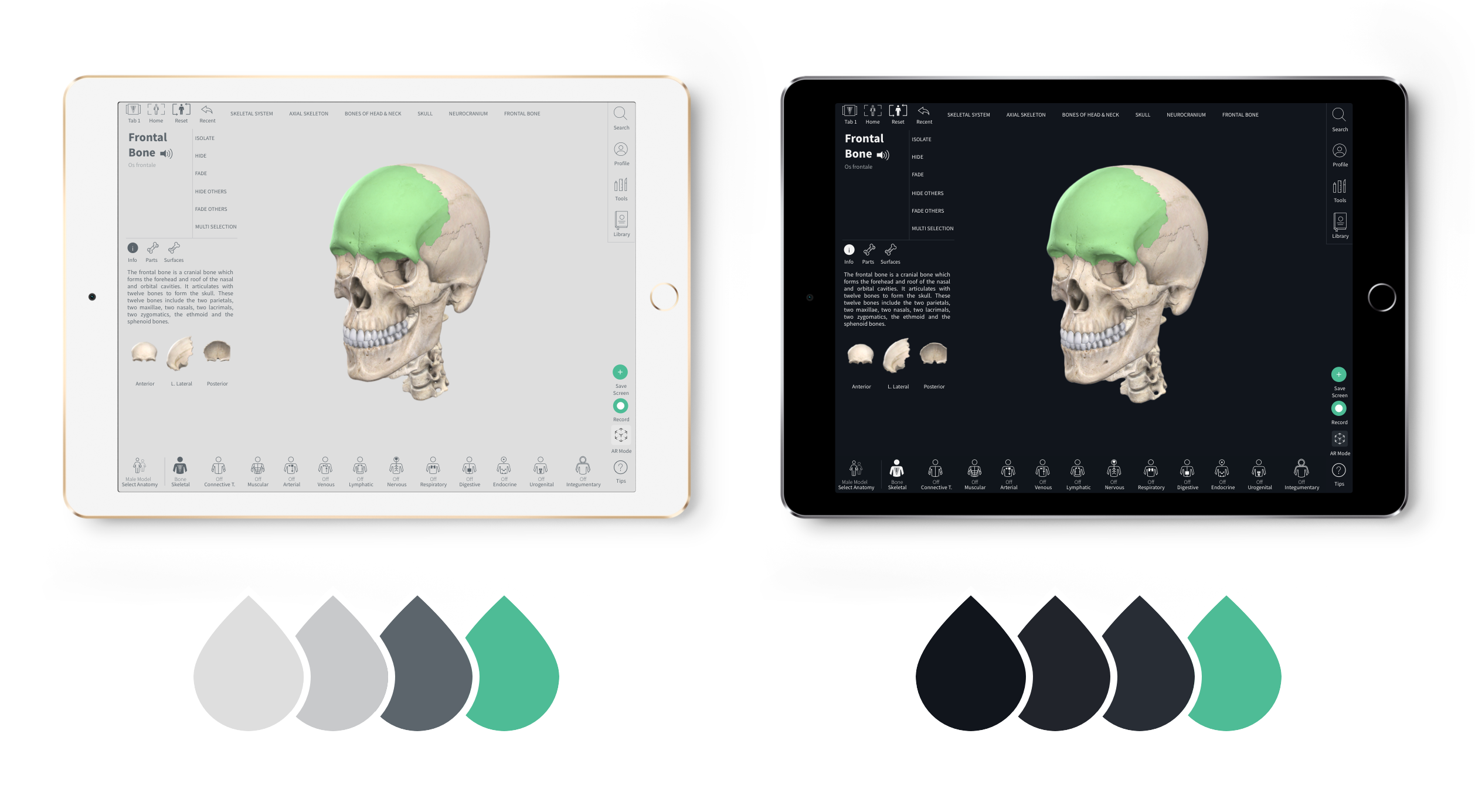
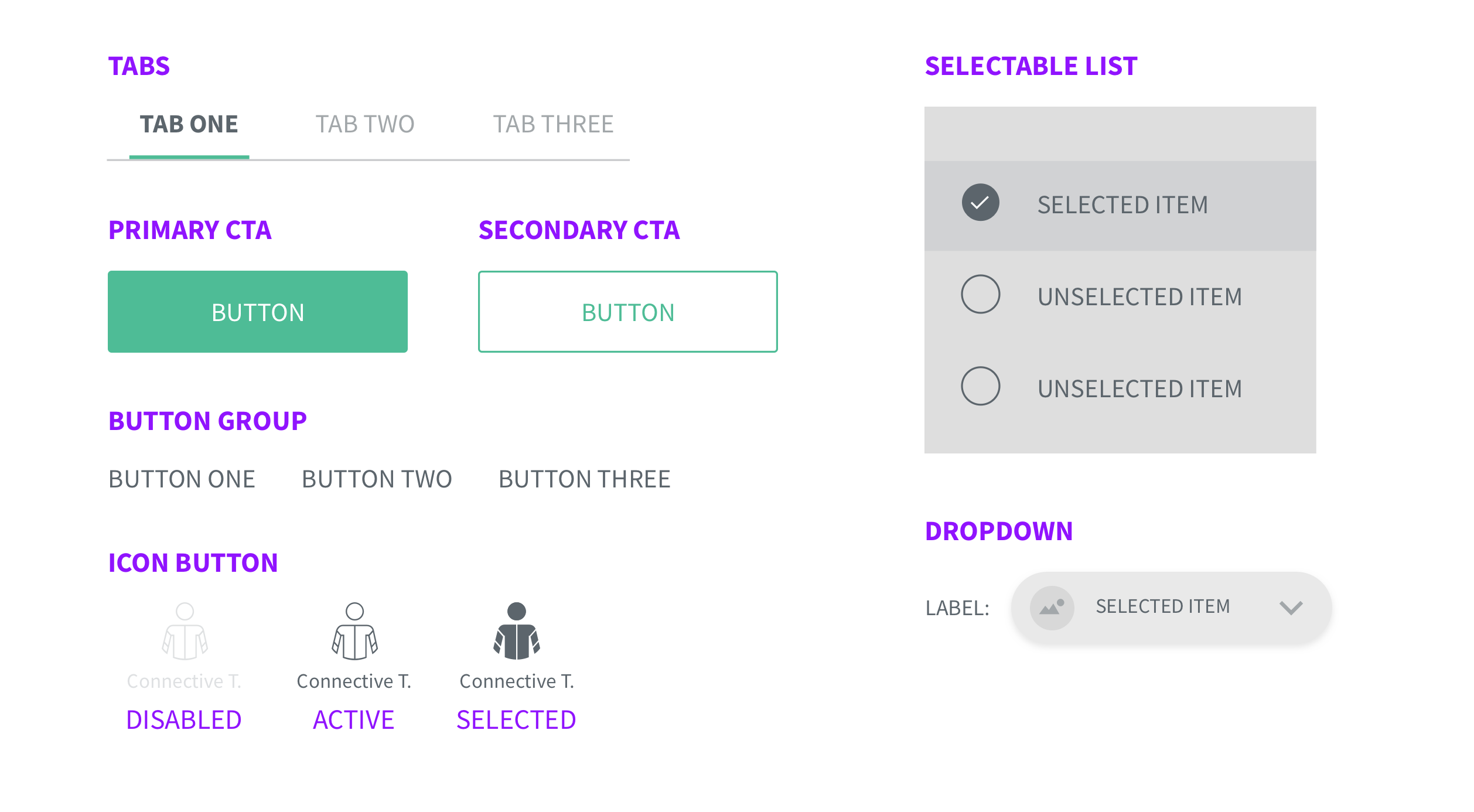
I retroactively fit a uniform colour palette, font table, and style guide around Complete Anatomy's existing design to inform the design and development process.
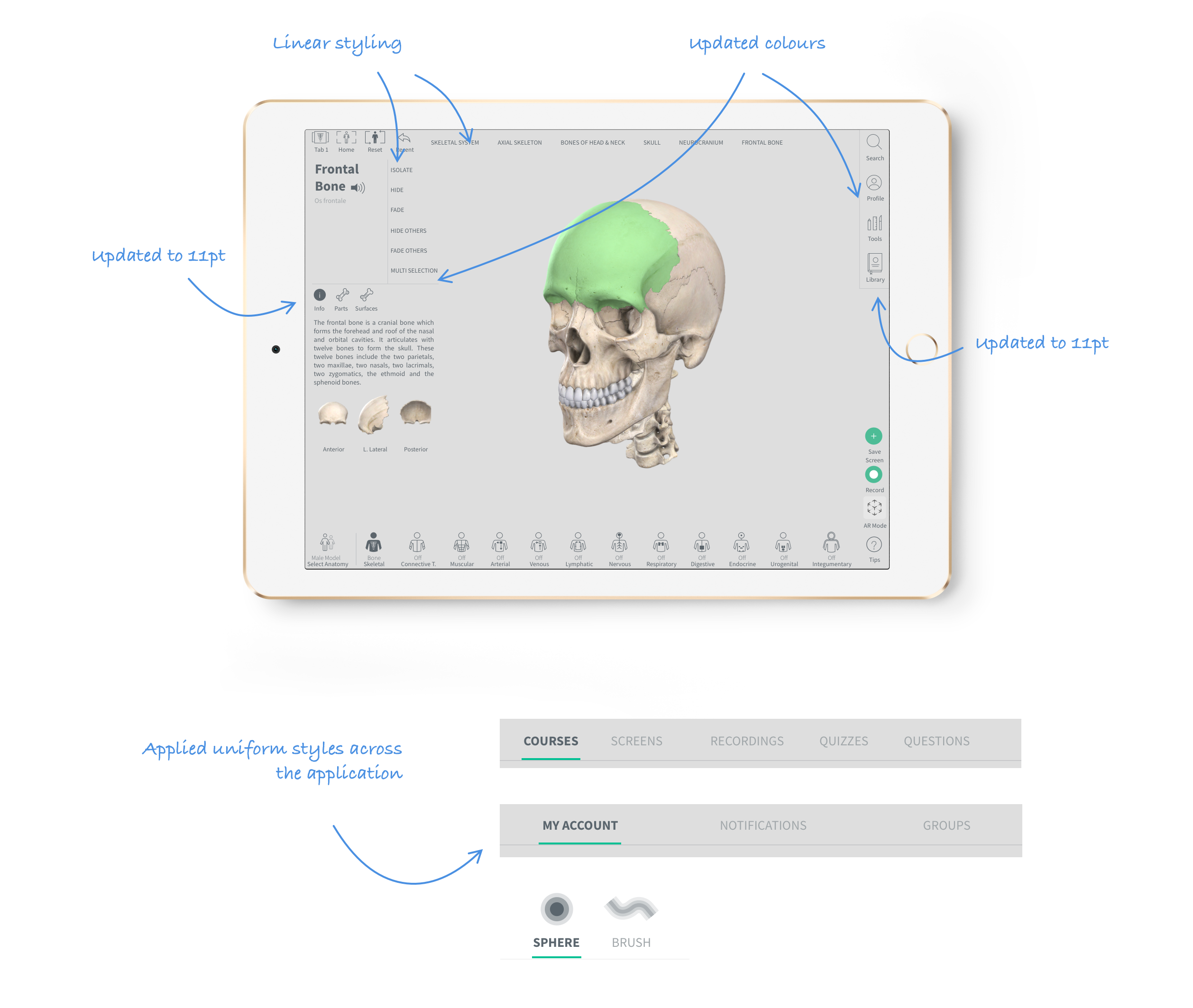
By creating uniform styles, we were able to assign meaning and uses to each. Specific styles were used in defined cases only, so that when designing new screens, we would have a set style applied.
Green #4EBC96 was used on interactive elements, or 12pt upper case was used for subtitles - we documented and applied style and font guides across the entire application.

In future, we could grow this design system and begin delivering some key user requests.
By applying CSS variables to our font styles and associating them with specific uses, we could allow users to dynamically change font sizes. We could create a flexible, dynamic font table that mapped to our styles, as shown in the Human Interface Guidelines.
This functionality is something that the Customer Service team consistently raise as an issue for users, and it often came up throughout our different user tests. Users needed the ability to increase the font size of the app to more easily read the structure information.
Complete Anatomy 2018 used a light grey colour palette. A dark background colour would provide greater contrast with the models, showing off the more intimate details and shapes of model structures. This feature made up almost 50% of customer requests to our Customer Service team, and was widely approved of when implemented.
The next step in this process is to examine our styles and structures, and build them into common reusable components. This is beginning to take shape in things like our content cards, our tabs, and our buttons.
Ultimately this would be fleshed out, creating a full component library, like the Angular Material libary.
It is a resource not only for developers, but designers too - a one stop shop for everyone involved in building and creating the designers.