UX Work at Fidelity
I worked on the UX Design team at Fidelity Ireland for 3 years. During my time there, I worked on a number of projects for both Fidelity International and Fidelity Investments. Fidelity Investments covers any Fidelity business conducted in the United States, while Fidelity International is responsible for business conducted in the United Kingdom.
A lot of what I worked on was confidential, so the designs are not shown in full here. Designs are shown through sketches that were developed during the design process and used to illustrate ideas.
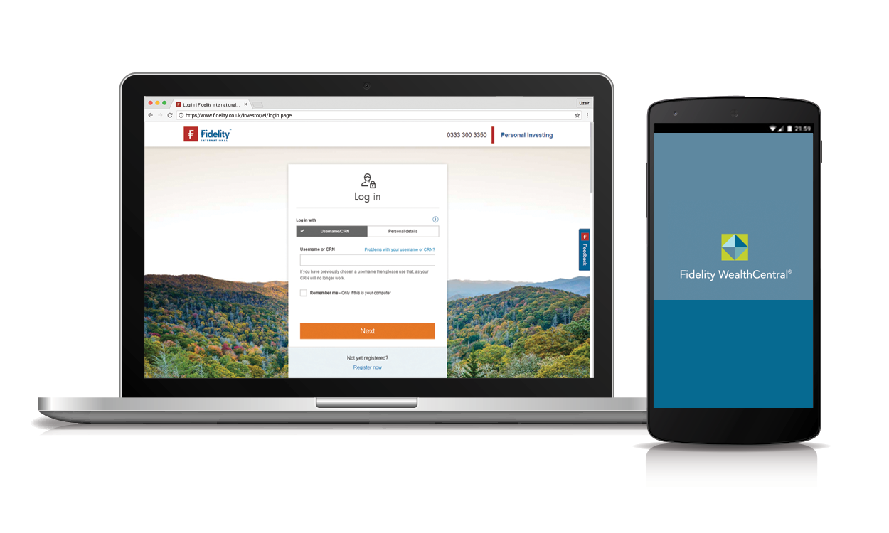
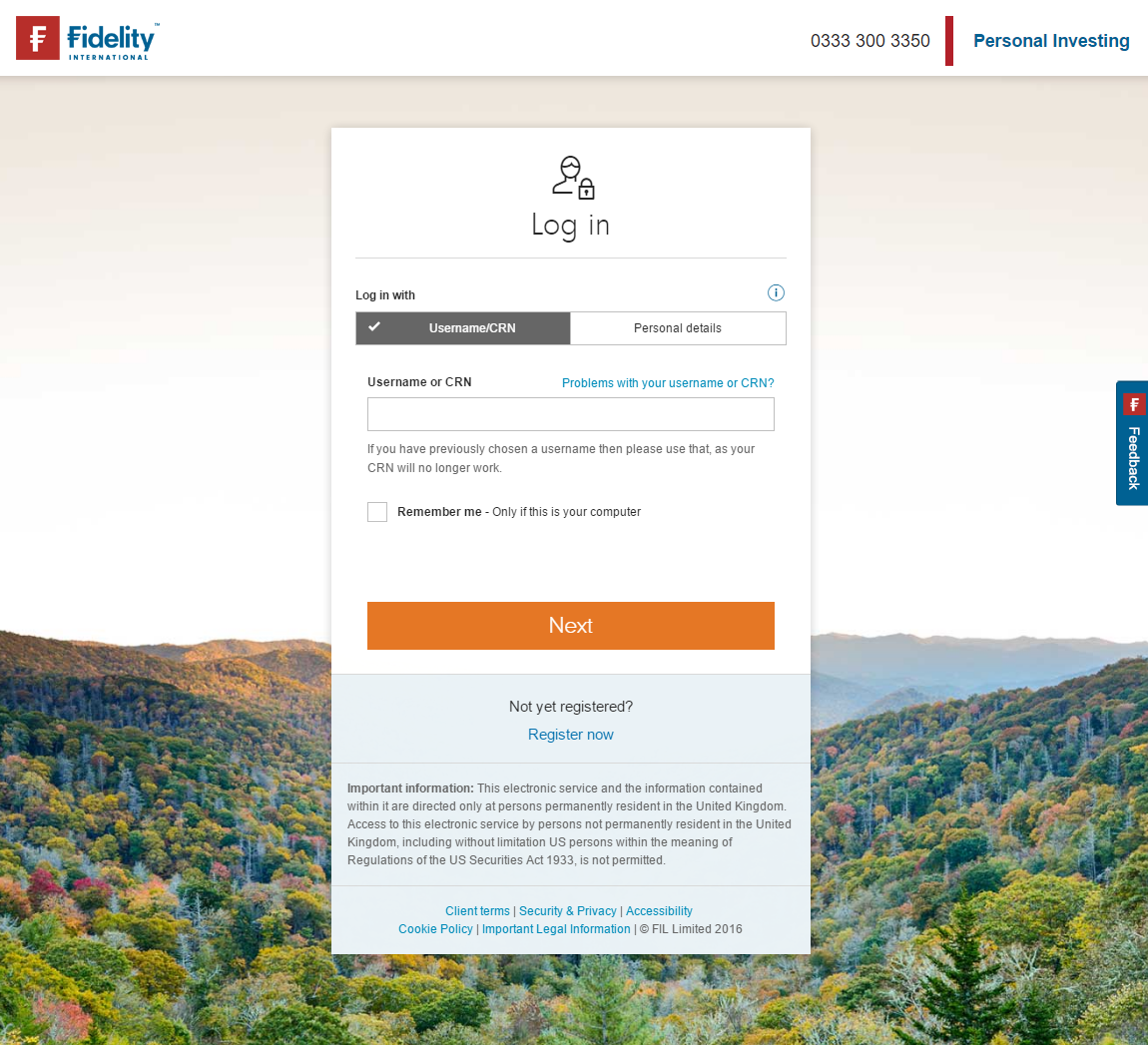
During my work for Fidelity International, I worked as a UX Designer on the Login and Register workflows. The designs are currently in use at Fidelity.co.uk, and are available for both Login and Register.
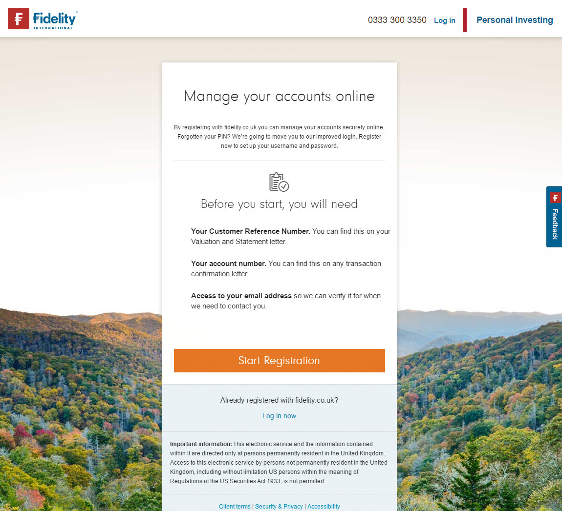
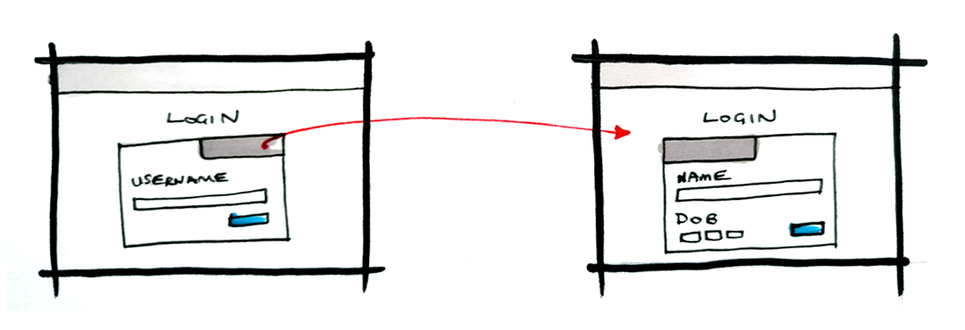
The two flows allowed users to convert from their old Customer Reference Number to a new Username to login.
My role on this project was to rendezvous with a number of different teams from Business to Development, and create a set of designs that would fulfil user, business, and development needs.
The Login screens provided a number of learning opportunities: there were a lot of design requirements that came from both business and development teams that needed to be incorporated into the designs, all while not affecting the user experience.
The wireframes were built as an interactive prototype built with Axure, before being worked on with a UI Designer to create the finished visual designs.
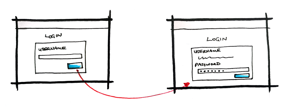
Security requirements meant that users had to enter a username for validation before they could enter a password. This workflow was broken on to different screens to avoid an unexpected reload when the user is entering data into a form.
By rendezvousing with the Business team, additional business requirements were defined.
Business requirements allowed users to login using their personal details, like name and date of birth. These details were integrated into a responsive tab, allowing users to switch between the two modes for login.
Another project I worked on as part of the Fidelity International team was the Account Summary page. I worked as the UX Designer on the project, producing wireframes and workflows in Axure based on inputs from business, research, and development teams.
The Account Summary page gave users an overview of how each of their accounts were performing over time.
Navigation
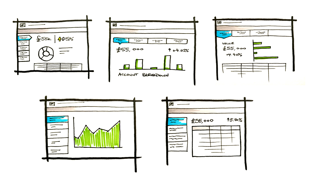
The intention of the page was to give users a page where they could see summarised data about how each of their accounts were performing. The page went through a number of iterations, and had input from a large number of people. The initial focus was on how the screen integrated with the top navigation, which was managed by other members of the design team. It took a concerted effort to build and test different variations of the Account Summary page with different navigation styles. Some of these styles can be seen in the sketches above, with a lot of focus on whether the design should have a horizontal or a vertical account navigation. Through a process of user testing and iterative design, the vertical design proved more effective with users.
Different Graph Types
A number of graphs were also tested; maps of fund performance overtime, breakdowns of where money in certain accounts was, and investment prediction tools. This proved a valuable lesson over the course of the project: while users responded very strongly to the charts, there simply wasn’t time in the development cycle to build robust, effective charts. They were replaced with simple figures showing the raw data.
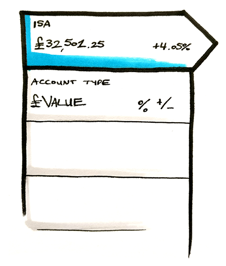
Accounts List
The list of accounts along the left of the screen features a number of details about each account. Again, this component went through many rounds of testing before settling on the simple display it ended up with. It was also designed to behave responsively, hiding behind a hamburger menu on smaller screens.
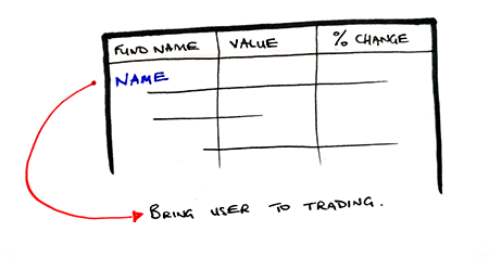
Fund Table
The final component was the Fund Table. It shows funds that a user has invested in, and brings the user to the trading pages when clicked on. This piece also required looping in a number of other teams, as the trading pages were looked after by other members of the design team.
The Fund Table linked to the Trading pages, which required working closely with the designers on that project to provide seamless integration.
This page required work from a multidisciplinary team, and had input from many different designers on different teams. It was part of my role to collate, group, and manage their inputs as well as our own, so that the designs reflected the needs of everyone involved in design and production.
I worked on a lot of different projects with Fidelity Investments, focused mostly on their internal platforms Streetscape and WealthCentral. These programmes are used by investors to manage their accounts, make trades, and follow stock market trends.
Reports Visualization: Securities Allocation
One of the projects I worked on as part of the design team was a reports visualization tool, which gives summary information to investors about how certain funds are performing. The visualization tool had a number of different elements, but my main focus was on the Security Allocations screen. The intention was to provide an overview of an investor’s securities, which enabled users to progressively drill through groups to more detailed information.
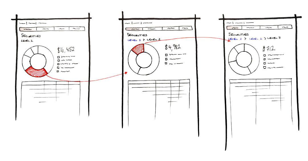
The charts showed summarized reports for securities groups, with more information available on hover and click events.
The final designs used a donut chart with a hover popup to show information. Clicking on a section of the donut would drill down to that group, redrawing the chart with new information. A breadcrumb is used for navigation to go back up the chain. Beneath the chart, a table shows the detailed information for each security in the group, filtered by the selection of the donut chart.
Development Constraints
This was an interesting project as it had a number constraints placed on it by the development team. Development was being done using a platform called WebFocus 8.0, which severely limited our ability to create custom workflows and user experiences. The original designs featured a custom bar chart.
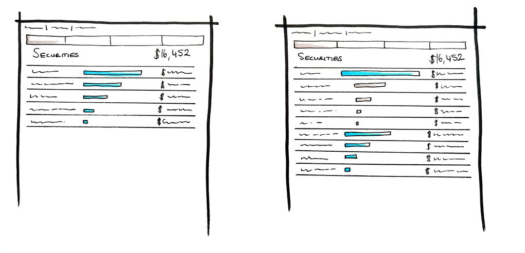
Original designs used a bar chart, but development constraints ruled out this concept.
The design, sketched above, was built around a table, with bars to represent a user’s holdings in a certain security group. The user could then click on the security group to expand it, revealing the makeup of the group underneath it. This design was built as a prototype, but unfortunately due to the pressure the development team were under to build something, a revised design was needed. The project eventually boiled down to customizing an out of the box experience using the WebFocus platform. A proof of concept was created by the design team, but was never brought forward to the development phase.