While working at 3D4Medical, there were a number of issues I worked on as part of design pitches in order to raise issues with the wider team. These issues are funnelled from a number of sources, like our Customer Service and Sales team, app reviews, or design team user testing.
When Complete Anatomy was initially designed, it was available only for iPad. Users had the ability to save a bookmark, or create a screen recording, and share it to other users. The recording wasn’t a video, but an interactive playback that could be paused and explored at any time. Creating interactive content left a technological issue: in order to ensure accurate playback, all content had to be made with a 4:3 ratio. This became an issue when Complete Anatomy was made available for other platforms.
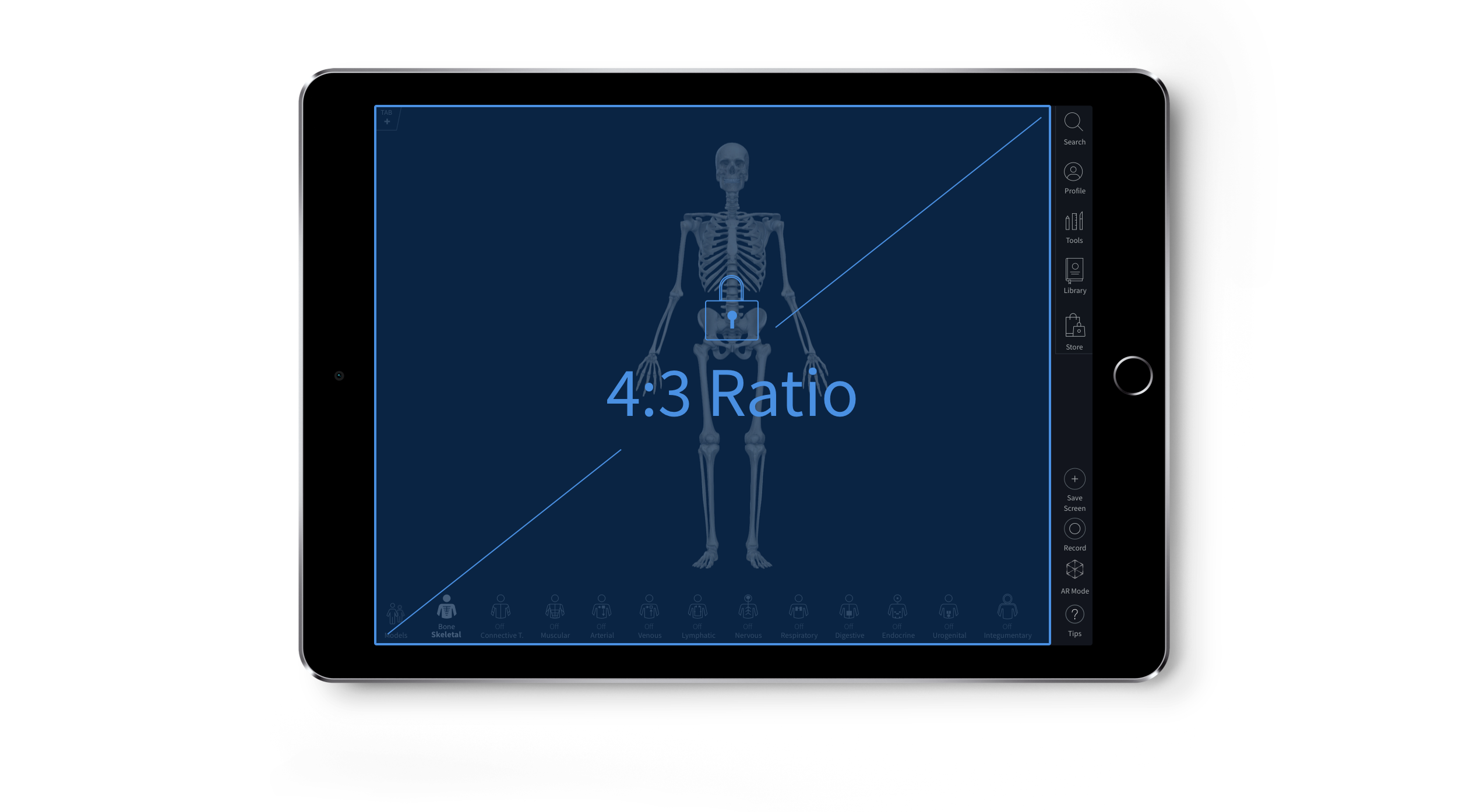
On both Mac and Windows, there was now a challenge - how could the 4:3 ratio be preserved? It was decided at the time that the simplest way to do this was to force the Tools panel to remain open at all times. This created a 4:3 ratio window for the model to be displayed.

While this solution fulfilled the brief from a technological standpoint, it quickly became frustrating for users. It is one of the most frequent customer complaints, and regularly led to negative app store reviews.
I did a body of research and exploration into how other apps manage content creation. I explored a number of concepts, and we could either redesign content to display responsively, or build a content creation mode that forced users into the 4:3 ratio. For the development team, rebuilding our content would be a mammoth task, with system wide repercussions. I pursued the content creation mode.
This mode wouldn’t affect users on iPad (our largest user base), and would only affect users on Mac or Windows when creating content - we know from a user database that the number of users creating content is quite low.
There were a number of issues to address. For example, if a user had set up a bookmark to save with some tools, how would those tools respond when entering Create mode?
This small set of designs was used as discussion tool for the wider team to help convince management of the need to further explore this design issue.
As Complete Anatomy grew as a product, it’s onboarding organically developed with each release. This meant there was never a concerted effort to review and assess the effectiveness of the workflow, and whether it was meeting both user and product goals. There were two primary aims for the onboarding: teaching users how to navigate and control model, and ensuring users register with 3D4Medical using an email.
The first steps in assessing the effectiveness of the flow was examining our conversion rates. We found that the Download > Register rate was very low: only 25% of users who download the app were registering. Once registered, purchase conversion was around 20% - both these conversion rates were taken as primary indicators for flow efficiency.
Mapping out the existing onboarding, there were many opportunities for improvement.
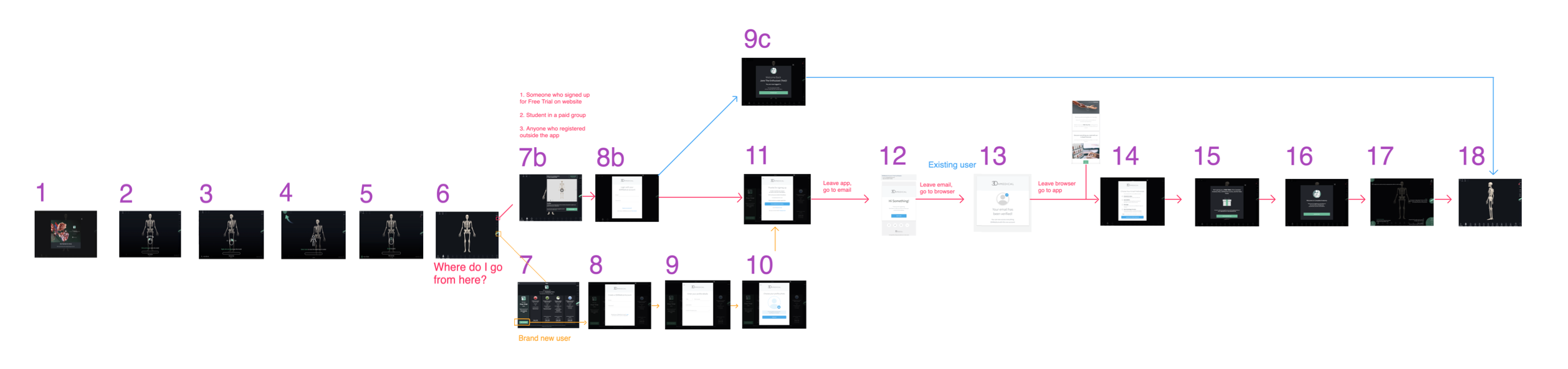
The existing flow has many friction points, and ample opportunity for improvement.
The beginning of this workflow is the Complete Anatomy App Store page. There are a number of small improvements that could be made here focussed on how easy the app is to find through search, reducing download size, and aptly describing how the app can used for different user types. The primary focus of this design exercise was the Download > Register flow, so while these options were explored, they are not developed on here.
One of the primary areas of research to inform the idea generation phase was to examine and assess other applications successful onboarding flows. There were a number of key concepts that arose from that examination process.
It is important to feel that you are not using the app in isolation, and that there is a network of other users out there. The app should draw users in, showing them the wealth of user content and value it contains. Social apps are made better when many users come together to contribute to a platform in a positive way - it can be a very powerful and persuasive tool for onboarding users.
This was a key question for Complete Anatomy. Throughout our ongoing research we found that users rarely used a wealth of functionality that was available - they stayed in the model view, and never accessed the vast library of interactive content. I identified our onboarding as a key reason why: the existing onboarding centred on how to use the app, rather than what to use the app for.
Lots of apps push their users directly into app content as a form of onboarding. Language learning app Duolingo front load their onboarding, pushing the user into a language learning flow first. It’s only after completing a number of lessons that users are prompted to create an account. They have already become invested in the app, making them more likely to create the account. Other apps focus on condensing their onboarding - both Slack and Evernote both only require an email to start using their apps, with other steps pushed back so users can see the app features and functionality first.

These research learnings were pulled into a number of workflows to demonstrate how the onboarding flow may be improved.

This new onboarding was used as a discussion tool with senior management to demonstrate how improving our onboarding would have a massive effect on the business as a whole.
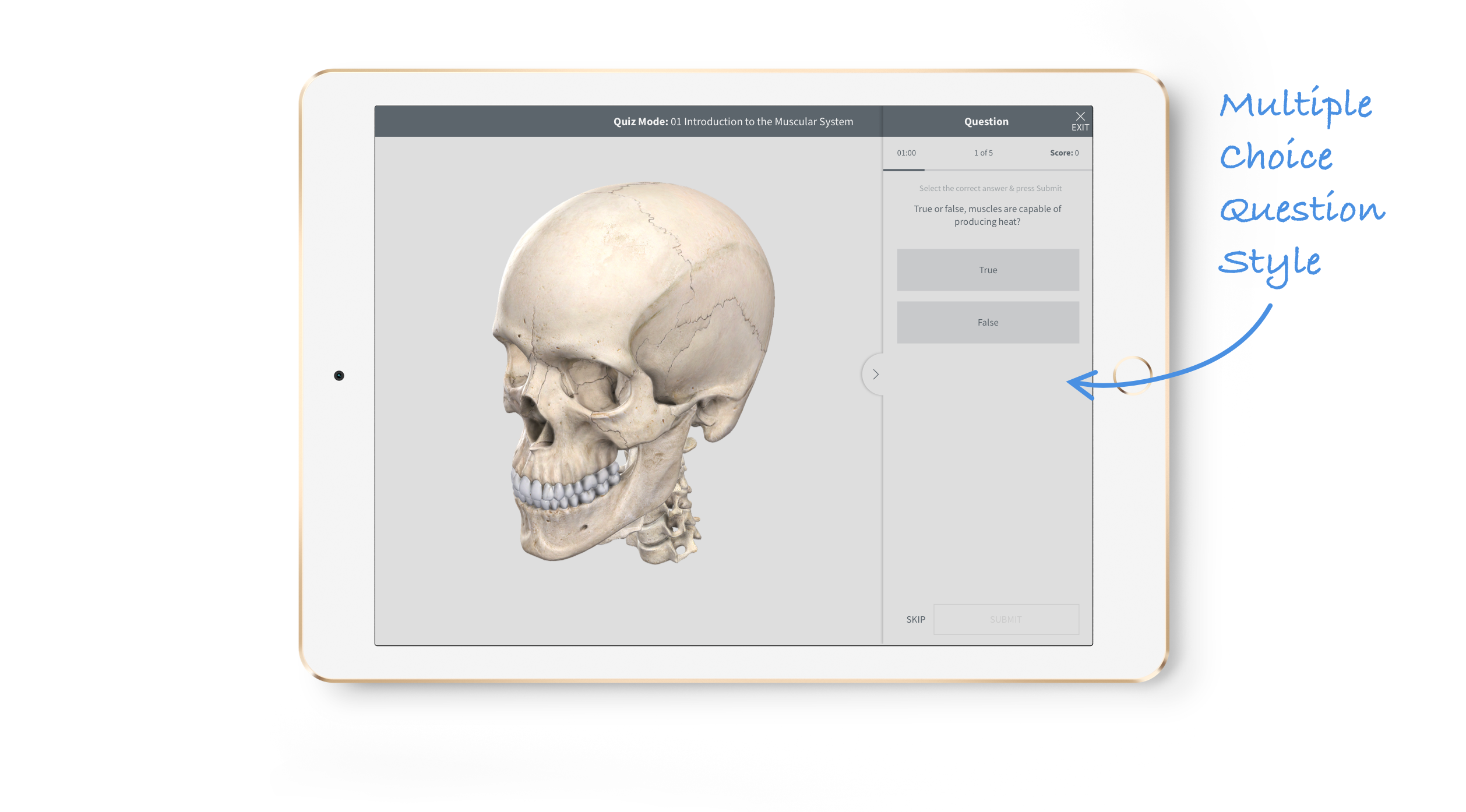
Complete Anatomy’s quiz feature allows users to build multiple choice questions and collate them into quizzes. This is especially useful for Lecturers, who can build custom quizzes to send to their Students. They can then monitor and assess student engagement via a dashboard.
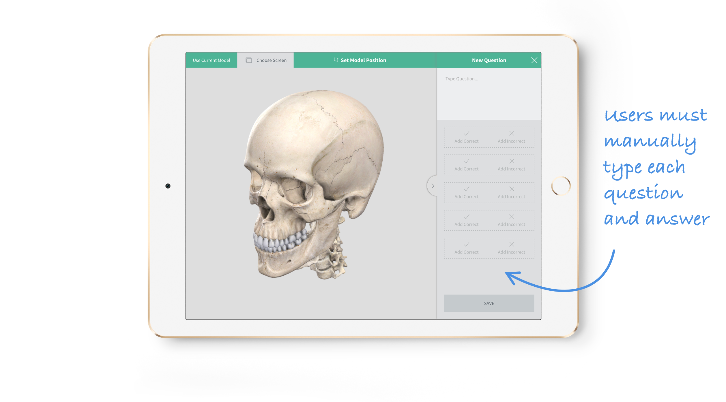
There are a number of issue throughout the Quiz creation process, making it a little cumbersome and difficult for users. Most issues users found were with the time it takes to create the questions, and the lack of options for question type. These issues arose via feedback from our institutional customers, after liaising with the Sales Management team.
Working closely with the sales and medical teams, I was able to create a list of requirements to help solve this issue for users. They needed more question types, and faster ways to create questions.
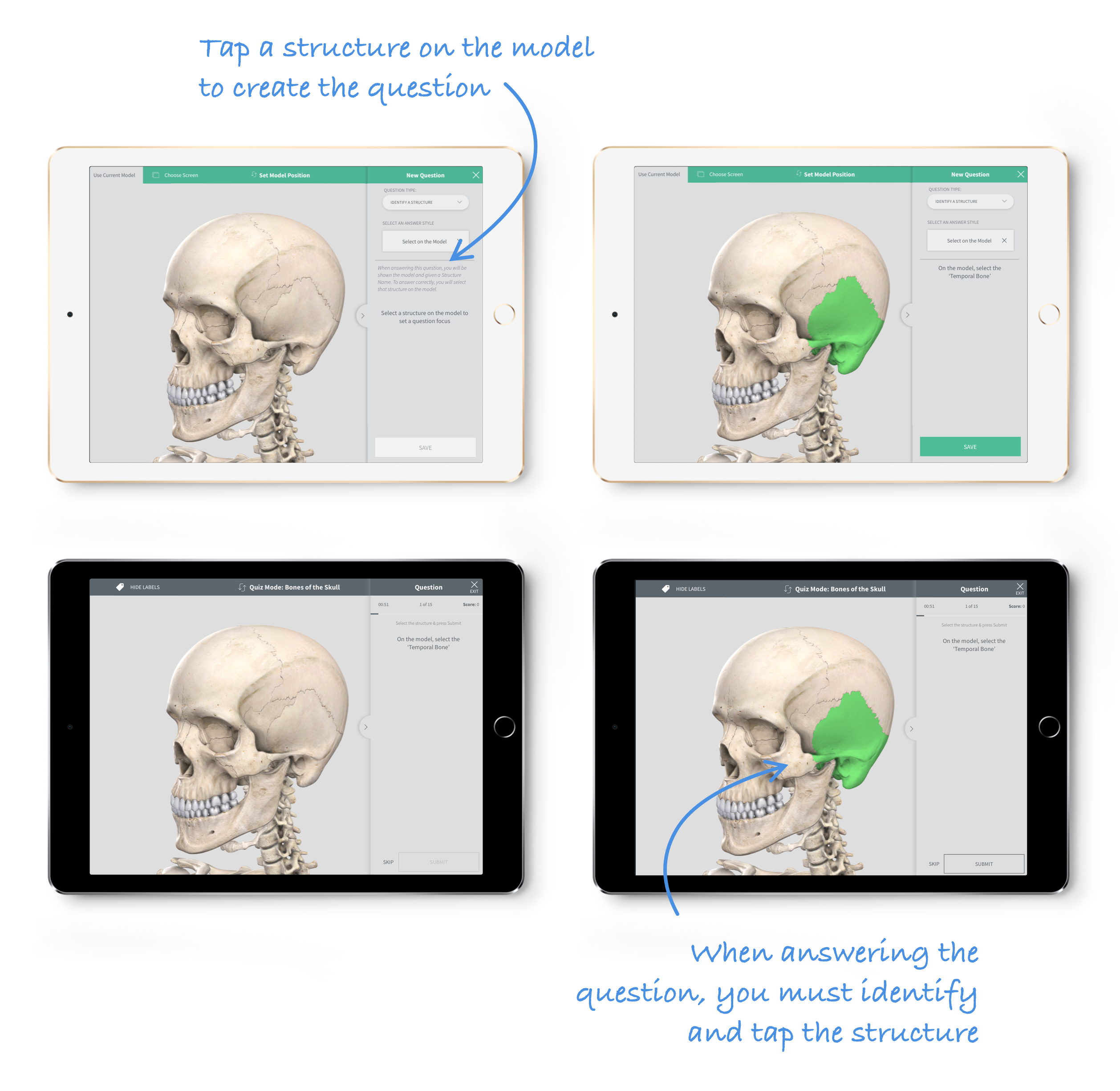
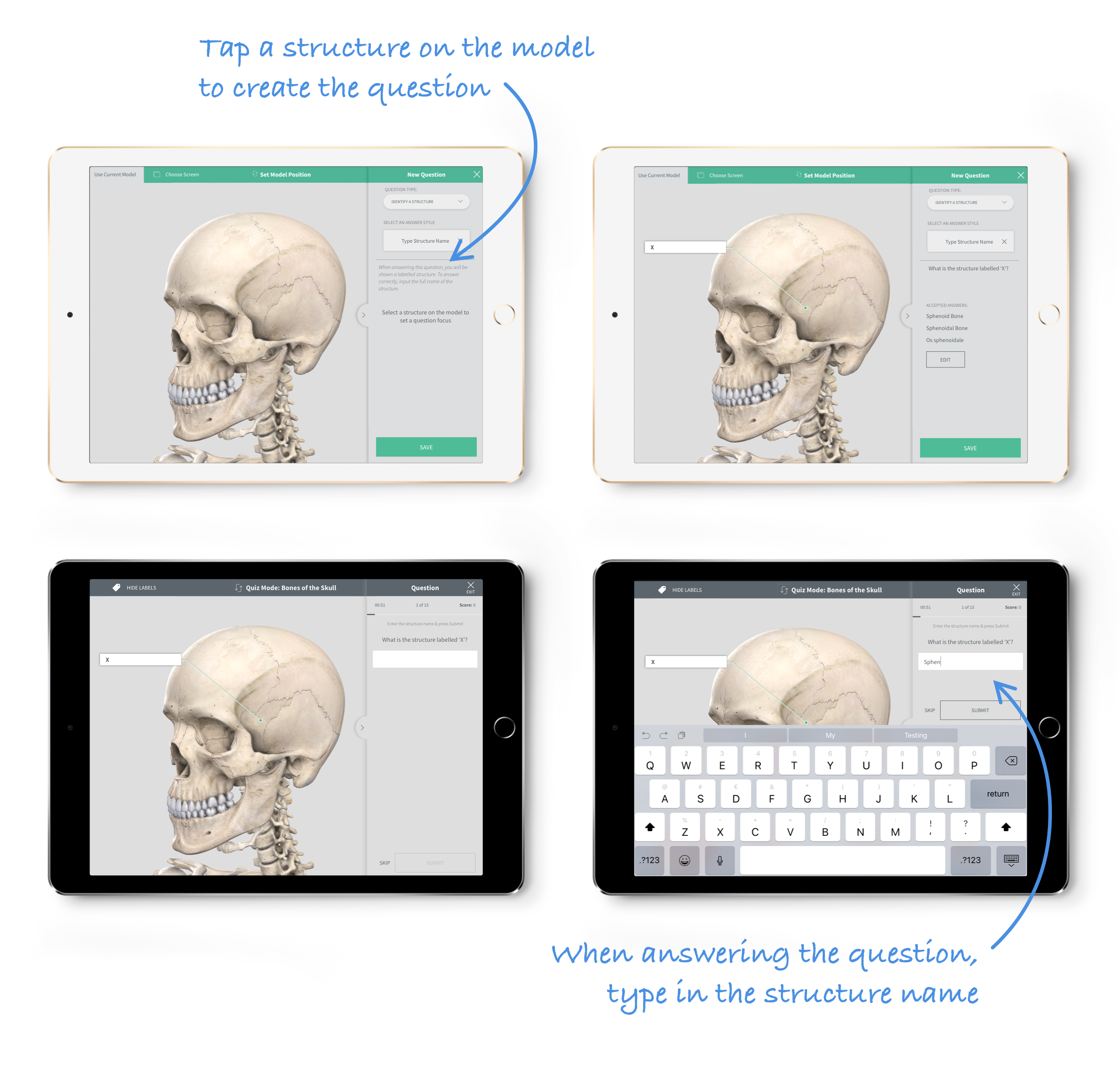
I aimed to replicate question structure that users would be familiar with: students have regular exams known as Spotter’s, where they are asked to identify structures on a cadaver. Using our model as a substitute, we created a number of question types mimicking this style.
We wanted to offer a faster way of creating multiple choice questions. Where users previously had to manually type in each answer and select the correct one, here all that is required is selecting the correct structure on the model.

In this new question style, users were given the name of a structure and asked to identify it by tapping it on the model. Again, when creating the question the user has to simply tap a structure to set the question focus.
This new question style highlights a structure on the model and asks users to type the name of the structure. This adds to the difficulty of the question by also testing the spelling of the structure. Once again, in creating the question all that is required is selecting a structure on the model.
Having flexibility in our question types also allowed us to fully investigate how we can automatically generate more questions, meaning there isn't as much workload placed on the user to create quizzes.